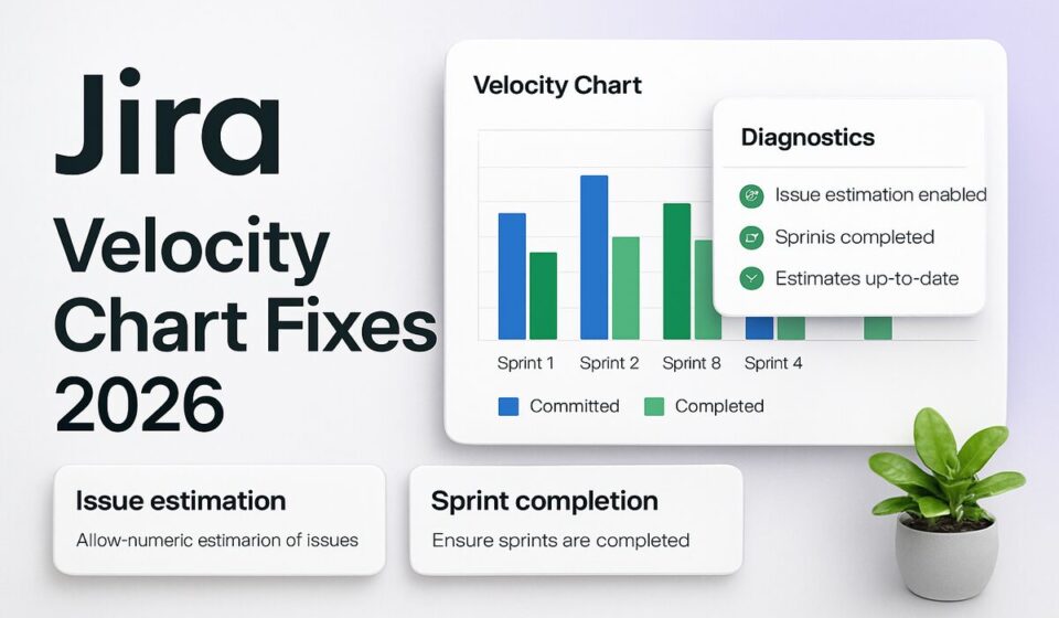

A Jira velocity chart shows wrong numbers almost always because of configuration, not a bug. The usual culprits: your board measures work item count instead of story points, the estimates you expected live on sub-tasks that the chart ignores, the board filter is quietly excluding issues, or your Done column isn’t mapped to the statuses your team actually finishes work in. Fix the board, and the chart corrects itself.
A suspicious velocity chart is rarely random. It’s usually one of six specific settings, and each one produces a slightly different flavor of wrong. Below is a plain-text table of contents, then a walkthrough of each cause with the exact fix. Work through them in order and you’ll find yours.
Jump to a cause:
- The estimation statistic is set to work item count
- Your points are sitting on sub-tasks
- The board filter is excluding issues
- Your Done column mapping is wrong
- Commitment looks too low after mid-sprint changes
- You’re looking for fix version data in the wrong report
The estimation statistic is set to work item count
This is the single most common reason a velocity chart looks wrong, and it’s the first thing to check. If your team estimates in story points but the chart is plotting whole numbers that happen to match your issue counts, the board is measuring the wrong thing.
The y-axis of the velocity chart shows whatever estimation statistic the board is configured to use. Per Atlassian’s documentation, estimates can be based on story points, original time, work item count, or any numeric custom field in your Jira system. With the statistic on work item count, a sprint where you closed eight tickets reads as “8” regardless of whether those tickets were worth 2 points or 20.
To check and change the estimation statistic on a company-managed board:
- Next to your board’s name in the sidebar, select More actions (•••), then Board settings.
- Select Estimation from the left-side menu.
- Use the Estimation method dropdown to switch how work items are estimated, for example to Story points.
Team-managed spaces work differently. Estimation isn’t on by default there. Go to Space settings → Features, turn on Estimation, then choose Story points or Time. Be deliberate about this, because Atlassian warns that enabling estimation in a team-managed space triggers several changes you’ll want to understand first. The official reference is Configure how your board estimates and tracks work.
One caveat worth stating plainly: changing the estimation statistic changes how every past sprint on the chart is measured, not just future ones. Don’t expect old bars to stay put after you switch.
Your points are sitting on sub-tasks
Here’s a trap that catches teams who break stories down aggressively. You estimate the sub-tasks, close them all, and the velocity chart barely moves. The parent story was left at zero, or unestimated entirely.
The velocity chart does not count estimates from sub-tasks. Only estimates on parent work items are included. That’s not a bug you can toggle off; it’s how the report is built. If your team’s habit is to put the points on the pieces rather than the story, the chart will systematically under-report your velocity because the numbers it wants to read simply aren’t there.
The fix is a process change, not a settings change. Estimate at the parent-story level and treat sub-tasks as a checklist for how the work gets done, not as the unit of estimation. If you’re rethinking how your team sizes work, our Jira sprint planning guide covers where estimates should live and why. Retroactively, you’d need to move or re-enter points onto the parents for the historical bars to reflect reality, which is tedious but sometimes worth it before a planning review.
The board filter is excluding issues
The velocity chart is board-specific. It only includes work items that match your board’s saved filter. That one sentence explains a huge share of “my velocity chart is wrong” tickets.
If your board filter is scoped to a single project, a specific component, a label, or a particular assignee, then any completed work that falls outside that filter is invisible to the chart, even though your team clearly did it. A board filtered to project = ABC AND labels = frontend can report half a team’s real velocity, because everything tagged backend lands in the same sprint but gets filtered out of the report.
To diagnose it, open the board’s saved filter and read the JQL carefully. Ask whether every kind of work your team completes in a sprint actually matches that query. Common offenders are filters that pin to a component, exclude certain issue types, or restrict by a status that resolved issues have already moved past. If the filter is too narrow, widen it, or accept that this board only measures a slice of the team.
This is also why velocity across multiple projects gets messy. A standard board filter tied to one project won’t aggregate work from others. If you need cross-project velocity, that’s a deliberate filter design decision, not something the chart does for you.
Your Done column mapping is wrong
The velocity chart decides what counts as “completed” based on your board’s column mapping. A work item is treated as Done when it sits in a status mapped to the right-most column of your board. A work item is To Do when it’s in a status mapped to the left-most column.
The failure mode: your workflow has a status like Deployed, Released, or Verified that your team considers finished, but that status isn’t mapped to the last column. So issues your team genuinely completed never register as completed on the chart, and the green Completed bar comes in low sprint after sprint. The work happened; the report just never saw the finish line.
To check the mapping:
- Open Board settings from the More actions (•••) menu next to the board name.
- Select Columns (the column configuration screen).
- Confirm that every status your team treats as “done” is mapped into the right-most column.
Any status that isn’t mapped to a column at all is worse than misplaced. Atlassian’s documentation on velocity discrepancies notes that work items in an unmapped status are still included in the sprint but count as zero estimation in the velocity report. So an orphaned status can silently zero out points you thought you’d earned.
Commitment looks too low after mid-sprint changes
Sometimes it’s not the green bar that’s off, it’s the gray one. The Commitment bar shows the total estimate of every work item in the sprint at the moment it begins. After the sprint starts, anything you add, and any estimate you change, is not reflected in commitment. The Completed bar behaves differently: scope changes made after the sprint started are counted in the completed total.
That asymmetry is intentional, and it’s actually the point of the chart, but it surprises people. If you add three stories to a running sprint and finish them, your Completed bar can legitimately exceed your Commitment bar. That’s not an error. It’s the chart showing you that your sprint scope grew.
There’s a subtler version involving cancelled work. Per Atlassian’s knowledge base article on velocity commitment discrepancies, the commitment value excludes work items that were moved to a status like Cancelled or Won’t Do before the sprint’s start date. Those items count as complete-or-cancelled-before-start and drop out of commitment. So if your commitment reads lower than the estimate sum you remember planning, check the work item history for anything resolved or cancelled just before the sprint kicked off.
The takeaway: before you conclude the chart is broken, confirm that you’re reading commitment and completed the way the report defines them. To keep sprints from silently ballooning, tighten the discipline around mid-sprint additions. If people are constantly dropping work into active sprints, an automation rule that flags issues added after sprint start gives you a clean audit trail without policing it by hand.
You’re looking for fix version data in the wrong report
This one deserves its own section because so many people arrive at the velocity chart trying to answer a release question. They want to know how a specific fix version is tracking, they open the velocity chart, and the numbers make no sense, because the velocity chart has nothing to do with fix versions.
The velocity chart is organized entirely around sprints. Its x-axis is your most recent completed sprints, and there is no fix version filter anywhere in it. If you assigned a fix version to a batch of issues and you’re trying to see them on the velocity chart, you’re using the wrong report. The chart will keep showing per-sprint bars no matter what fix version you had in mind.
For release-level progress, Jira has a report built for exactly that. The Version Report shows your team’s progress toward completing a version, including a predicted release date based on your team’s average rate of progress since the version started. Like the velocity chart, it’s board-specific and it excludes sub-tasks, but it’s organized around the version (the fix version you assign to issues) rather than around sprints. If you care about “when does this release ship,” that’s the Version Report or the Release Burndown, not velocity.
To open it: from the board sidebar, select Reports, then Version Report, then pick the relevant version from the dropdown. Keep the two mental models separate. Velocity answers “how much can this team do per sprint.” Fix version reports answer “how far along is this release.” Conflating them is the fastest way to distrust a chart that’s actually working fine.
Work the list before you blame the tool
Almost every wrong velocity chart traces back to one of these six settings, and none of them require a support ticket to fix. Start with the estimation statistic, because it’s the most common and the easiest to verify. Then check where your points live, whether the board filter is hiding work, and how your Done column is mapped. If the bars themselves are fine but the story is confusing, you’re probably reading commitment and completed differently than Jira defines them, or you wandered into velocity when you wanted a release report.
Velocity gets more trustworthy the more sprints you feed it, so once the configuration is right, resist the urge to keep tweaking. Let a few clean sprints accumulate before you use the number to forecast anything. And if you’ve done all this and the estimation model itself still feels like it’s fighting your team, that’s a different conversation. Our comparison of Jira versus Linear gets into how different tools think about estimates and cycle time, which is worth a look if the friction runs deeper than a mis-set dropdown. The full reference for everything above is Atlassian’s own guide to the velocity chart.
Sponsored