
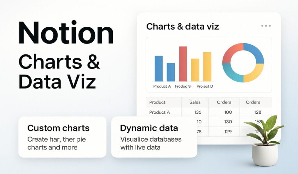

Notion charts are a database view type, not a standalone block. Add one by clicking the plus next to your view tabs and choosing Chart, then pick vertical bar, horizontal bar, line, donut, or number. Free workspaces get one chart; every paid plan gets unlimited. Charts read your data — they cannot edit it.
The five chart types, and one myth to ignore
Notion’s help center lists exactly five chart types: vertical bar, horizontal bar, line, donut, and number. That is the complete documented set on Notion’s chart view help page. No scatter plot. No combo chart. No dual axis. No separately named stacked-bar type.
If you have read claims about a “Breakdown By” control or a new stacked bar chart type arriving in 2026, treat those as unverified — neither name appears anywhere in Notion’s chart documentation. What genuinely exists is Group by under the Y axis, which splits each bar or line into sub-groups. Visually that lands close to what most people mean by a stacked bar, but it is a Y-axis setting on an ordinary bar chart, not a distinct type you select.
| Chart type | Best for | Configuration panel |
|---|---|---|
| Vertical bar | Comparing counts or sums across categories with a short label set | Full X and Y axis controls |
| Horizontal bar | The same comparison when category names are long | Full X and Y axis controls |
| Line | Change over time, including running totals | Full X and Y axis controls |
| Donut | Share of total across a small number of categories | A Data panel instead of X/Y |
| Number | A single headline figure | Not documented on Notion’s charts page |
That last row is deliberate. Notion documents axis configuration for bar and line charts and a separate Data panel for donut charts, but publishes nothing about configuring the number chart. Any tutorial listing specific number-chart settings is going beyond the official page, so verify it in your own workspace before you build a reporting process on it.
Adding a chart view to a database
Chart view attaches to a database you already have, so start there rather than on a blank page.
- Open the database, then click the + next to the database name or next to your current view tab.
- Select Chart from the dropdown menu.
- Open the settings menu at the top right of the database.
- Under chart type, choose Vertical bar chart, Horizontal bar chart, Line chart, Donut chart, or Number chart.
Starting from a page instead works too:
- Type
/chartin the page body. - Select the chart type you want from the menu that appears.
- Link an existing database, or select New chart to create a new one.
Both routes produce the same object. That matters more than it sounds: a chart view sits in the database’s view list, so every collaborator with database access sees the tab. If you want a chart somewhere without exposing the whole view stack, build it inside a linked view instead. The mechanics of linked views, and the relation plumbing behind them, are covered in the Notion linked databases, relations and rollups guide. If databases themselves are still new territory, start with the Notion database guide first, because a badly modeled database produces a badly shaped chart no matter how you configure the axes.
Configuring the X and Y axes
Axis configuration applies to bar and line charts only. Donut charts use a different panel, and again, the number chart has no documented axis controls.
To set up the X axis:
- With the chart view open, open the settings menu at the top right of the database.
- Under X axis, set What to show to the property that belongs along the bottom — status, assignee, or a date property for a time series.
- Use Sort by to control ordering. Sorting status ascending runs to-do through complete, which is what you want for anything read as progress.
- Click the eye icon beside any option under Visible groups to remove it from the chart. Hidden options move to Hidden groups.
- Toggle Omit zero values depending on whether categories with no items should still appear on the axis.
Then the Y axis:
- In the same settings menu, open Y axis.
- Set What to show to a numeric property, or choose Count to plot the number of items.
- Set Group by to break the series into sub-groups, or None to keep it flat.
- Toggle Cumulative to show a running total rather than per-period values.
Cumulative is the most useful control in the panel and the one people rarely find, because Notion only surfaces it when the chart is showing Count or Sum and the X axis property is sorted ascending. Get either condition wrong and the toggle simply is not there. Fix the sort first, then look again.
Properties that refuse to chart
Notion is specific about this: chart axes cannot show rollups, buttons, unique IDs, files and media, or formulas that resolve to a list of outputs. Donut charts carry the same exclusions for rollups, buttons, unique IDs, files and media, and certain formulas.
This wrecks a common setup. If your “Total hours” or “Budget spent” column is a rollup from a related database — which is how most people build a metrics layer in Notion — that property will not appear in the axis dropdown. The usual workaround is to express the value as a number or formula property instead. Notion warns in the same documentation that formulas based on relations and rollups, and other complex formulas, can make charts noticeably slower to load, so this is a trade rather than a clean fix. If you are writing that formula from scratch, the Notion Formulas 2.0 guide covers the current syntax.
Hard limits to design around
- 200 groups and 50 sub-groups per chart. Notion gives 200 days on the X axis as its own example, which means a daily time series covers roughly seven months before it truncates.
- No editing from chart view. You need a table, board, or other view to change the underlying data.
- Drilldowns are table views only. Click into a bar and you get a table. Inside it you cannot bulk-select rows, freeze columns, run calculations like Count or Percent, or add new database pages. To keep a drilldown, select ••• at the top of it and choose Save as view in.
- Sub-items are hidden by default. If sub-tasks are missing from your counts, open the database settings menu, select More settings, then Sub-items or Sub-tasks, and set Show as to Flattened list.
- Large databases update slowly. Notion says so directly. If charts are crawling or blank, that is worth diagnosing properly — see how to diagnose a Notion database that will not load.
Charts on a page: dashboard view or inline columns
There are two ways to get several charts side by side, and your plan decides which one is available.
Dashboard view is a database view type that arranges widgets — charts, tables, boards, calendars, timelines — into a fixed grid. It supports up to four widgets per row and twelve total, and it has global filters that apply across widgets through Filter multiple sources. The catch is plan gating: Notion’s dashboard view documentation states plainly that dashboard views are available on Business and Enterprise plans.
To build one, assuming you are on a qualifying plan:
- Open the database, full-page or inline, and select + Add a new view.
- Select Dashboard. You land in Edit mode.
- Click the + on a row or at the bottom to add a widget, then pick an existing view or create a new one for it.
- Drag the handle between two widgets to resize widths, and drag a row boundary to change heights.
- Switch to View mode for daily use, which keeps the layout from being nudged out of shape.
One trap in that flow: filters and sorts you apply in View mode are stored locally and do not persist to the dashboard for anyone else unless you select Save for everybody and hold edit permissions. People routinely think they have shared a filtered dashboard when they have only filtered their own screen.
On Free and Plus, the alternative is the older approach Notion still recommends for freeform layouts: create linked views of your databases, set each one to chart, and arrange them in page columns. You lose the fixed grid and the global filters, but you gain the ability to mix charts with headings, callouts, and text on the same page.
Plan gating at a glance
| Capability | Free | Plus | Business | Enterprise |
|---|---|---|---|---|
| Number of charts | 1 | Unlimited | Unlimited | Unlimited |
| All five chart types | Yes | Yes | Yes | Yes |
| Export as PNG or SVG | Yes | Yes | Yes | Yes |
| Export without the “Made with Notion” watermark | No | Yes | Yes | Yes |
| Dashboard view | No | No | Yes | Yes |
The watermark row deserves a note. Notion ties watermark removal to removing the chart background, and that background option is a paid-plan feature. So a Free plan chart pasted into a client deck arrives branded. Current tier names and rates are on Notion’s pricing page, and our own breakdown of what each tier actually buys sits in the Notion pricing guide.
Deleting your one free chart releases the slot, which is worth knowing before you upgrade over a chart you no longer use. Free plan users who duplicate a template containing several charts will only see one of them.
What Notion charts are not good for
Being blunt about this saves teams a migration they will otherwise attempt twice.
A chart view reads exactly one data source. You cannot join two databases into one chart. Dashboard views can hold widgets from different databases in one layout, but each widget still points at a single source, so anything requiring a real join — revenue against headcount, tickets against customer tier — has to be modeled as a single database first or computed elsewhere.
The aggregation model is thin. You get property values, Count, and a cumulative toggle. There are no calculated measures, no ratios between two series, no trendlines, no forecasting, no statistical overlays. If your reporting question is “what is our conversion rate by segment, month over month,” Notion charts will not answer it without you precomputing the rate as a property.
Export is image-only. PNG and SVG, and those save options are not currently available in the Android app. Nobody downstream receives numbers they can re-cut; they receive a picture. Anyone who needs the underlying figures needs access to the database itself, which turns into a permissions conversation rather than a reporting one.
And the 200-group ceiling quietly rules out long daily histories. Multi-year daily tracking will not fit. Roll up to weeks or months, or accept truncation.
Where charts do earn their place is the middle ground: a team that already lives in Notion, wants status visible without opening a second tool, and needs a bar chart of open work by owner more than it needs a warehouse. That is a genuinely good fit, and it removes a real point of friction. It is not a replacement for a BI stack, and treating it as one usually ends with someone rebuilding the same numbers in a spreadsheet anyway. If you are weighing how far Notion stretches before it stops holding, our write-up on Notion for teams, including where it breaks, goes through the other pressure points.
Frequently asked questions
Can you make charts on Notion’s free plan?
Yes, but only one. Notion’s help page states Free plan members can try a single chart, while every paid plan gets unlimited charts. Deleting that one chart frees the slot for another. If you duplicate a template containing several charts on a Free plan, only one of them will be visible to you.
Why is my rollup missing from the axis dropdown?
Because rollups are excluded by design. Notion documents that chart axes cannot display rollups, buttons, unique IDs, files and media, or formulas returning a list of outputs. Donut charts carry the same restriction. Rebuild the value as a number or formula property, and expect slower loading if that formula depends on relations and rollups.
Can one Notion chart pull from two databases?
No. A chart view belongs to a single database and reads a single data source. Dashboard views can combine widgets drawn from multiple databases within one layout, but each individual widget still points at one source. If you need a genuine join across datasets, that work has to happen before Notion sees it.
How do I export a Notion chart as an image?
Open the settings menu at the top right of the chart view and select Save chart as. Adjust the background, then choose Copy as PNG, Download PNG, or Download SVG. Notion notes these options are not currently available in the Android app. Paid plans can drop the background and the watermark with it.
Why are my sub-tasks missing from the chart?
Check the sub-item display setting. Notion’s chart documentation says sub-items and sub-tasks may not register until you open the database settings menu, select More settings, then Sub-items or Sub-tasks, and change Show as to Flattened list. Until then the chart counts only top-level rows.
Sponsored