How to Set Up Asana Reporting and Dashboards in 2026: Complete Guide
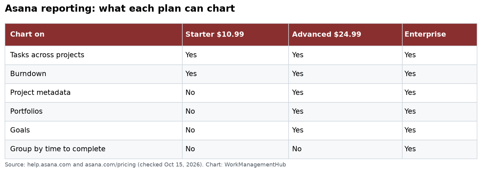
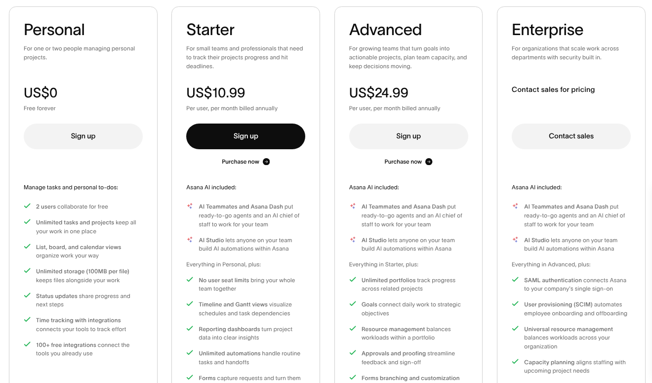
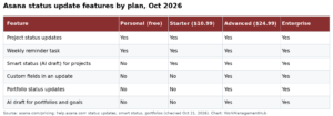
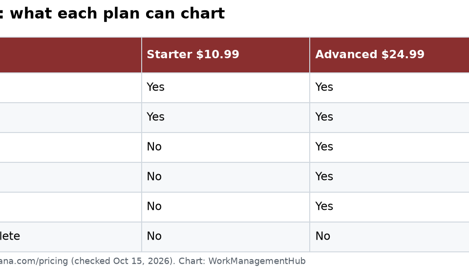
- Asana reporting dashboards are plan-gated: the Free plan has zero dashboard functionality; project dashboards require Starter ($10.99/user/month); portfolio dashboards and universal reporting require Advanced ($24.99/user/month).
- Six chart types are available — column, line, burn-up, donut, number, and lollipop — all buildable from pre-built templates or from scratch.
- Every widget is live: clicking any data point drills down to the exact tasks, projects, or goals behind the number.
- Asana Goals integrates directly into dashboards, making OKR progress visible alongside project health in one view.
- Portfolio dashboards surface health statuses, progress bars, and owner assignments across every project in a portfolio — essential for cross-functional program management.
- Dashboards can be kept private or shared selectively, giving leaders clean executive views without exposing operational noise.
To set up Asana reporting dashboards, navigate to a project or portfolio, click the Dashboard tab, then add widgets by selecting chart types (column, line, donut, etc.) linked to live task or goal data. Project dashboards require the Starter plan; universal reporting and portfolio dashboards require the Advanced plan at $24.99/user/month.
- Plan Requirements: What You Get at Each Tier
- How to Set Up a Project Dashboard
- Chart Types Explained: Choosing the Right Widget
- Portfolio Dashboards: Cross-Project Visibility
- Universal Reporting: Building Cross-Team Reports
- Connecting Asana Goals to Your Dashboards
- Sharing, Permissions, and Privacy Controls
- Dashboard Best Practices by Team Size
- Verdict
- Frequently Asked Questions
How to Set Up Asana Reporting and Dashboards in 2026: Complete Guide
Most teams using Asana are sitting on a goldmine of project data they never surface. Tasks are completed, deadlines are hit or missed, workloads fluctuate — but without dashboards, leaders are making decisions from memory and status emails rather than live data. Setting up Asana reporting dashboards changes that completely, connecting raw task data to visual, drillable charts that update the moment anything in your workspace changes.
This guide walks you through every layer of Asana’s reporting stack: from simple project dashboards for team leads on the Starter plan, to cross-portfolio executive views that require Advanced. You’ll know exactly which plan unlocks which feature, how to configure each widget type, and how to build dashboards that actually get used in weekly reviews — not just created and forgotten.
Plan Requirements: What You Get at Each Tier
Before spending an hour building a reporting setup that doesn’t exist at your plan tier, understand the access model. Asana reporting dashboards are gated aggressively by plan, and the jump between tiers is significant.
| Plan | Price | Reporting Access |
|---|---|---|
| Free | $0 | None — zero dashboard or reporting functionality |
| Starter | $10.99/user/month (annual) | Project-level dashboards with all chart types |
| Advanced | $24.99/user/month (annual) | Portfolio dashboards + Universal Reporting + Goals dashboards |
The Free plan’s omission of dashboards is a deliberate product decision, not an oversight. If your team is on Free and needs any reporting visibility, upgrading to Starter is the minimum viable step. For operations teams, program managers, or any leader overseeing more than one project simultaneously, the Advanced tier is where Asana reporting dashboards become genuinely powerful.
It’s worth pairing your reporting setup with Asana automation rules — automating task status changes and assignments means your dashboard data stays accurate without manual updates from the team.
How to Set Up a Project Dashboard
Project dashboards are the entry point for Asana reporting dashboards and are available on Starter and above. They live inside a single project and pull data exclusively from that project’s tasks. For team leads managing one product, campaign, or initiative, this is where you spend most of your reporting time.
- Open your project — Navigate to any project in the left sidebar. You need Starter or above; on Free, the Dashboard tab is absent.
- Click the “Dashboard” tab — This appears in the project’s top navigation bar alongside List, Board, Timeline, Calendar, and Workflow tabs.
- Click “Add chart” — The chart builder panel opens on the right side of the screen. You’ll see two options: start from a template or build a custom chart.
- Select a template (recommended for first-time setup) — Asana provides pre-built templates for common views: incomplete tasks by assignee, tasks completed over time, tasks by section, overdue tasks, and more.
- Choose your chart type — Use the “Chart type” dropdown to switch between column, line, burn-up, donut, number, or lollipop.
- Configure the X and Y axes — Set what the chart measures (e.g., count of tasks, count of incomplete tasks) and how it’s grouped (e.g., by assignee, by due date, by custom field value, by section).
- Apply filters — Narrow the data by assignee, due date range, custom field values, completion status, or section.
- Click “Add to dashboard” — The widget appears on the dashboard canvas. Repeat to add more charts.
- Drag and resize widgets — Drag chart cards to reorder them. Grab the bottom-right corner of any card to resize it.
- Save your layout — Asana saves dashboard layouts automatically. There’s no manual save step.
Once live, every widget refreshes in real time. Clicking any bar, slice, or data point opens a side panel showing the exact tasks behind that number — no pivot tables, no exports required.
Chart Types Explained: Choosing the Right Widget for Your Asana Reporting Dashboard
Choosing the wrong chart type is the most common dashboard mistake. Here’s how to match chart type to business question:
Column Chart
Best for: Comparing categories at a point in time. Use this to show incomplete tasks by assignee, tasks by section, or custom field distribution. The go-to chart for weekly team reviews. Pairs naturally with Asana workload management conversations.
Line Chart
Best for: Trends over time. Tasks completed per week, number of overdue tasks trending up or down, new tasks added per day. Right choice for retrospectives where you need to understand direction, not just current state.
Burn-Up Chart
Best for: Project delivery tracking. Shows total scope versus completed work over time, making it immediately clear whether a project is on pace. If you’re using Asana Timeline view to plan work, the burn-up chart is its reporting counterpart.
Donut Chart
Best for: Proportional breakdowns. What percentage of tasks are high priority vs. medium vs. low? Limit to six segments maximum — more becomes unreadable.
Number Chart
Best for: Single KPI callouts. Total incomplete tasks, total overdue tasks, tasks due this week. Combine three or four number charts side-by-side to give stakeholders an immediate project health read.
Lollipop Chart
Best for: The same use cases as column charts, but with cleaner visual presentation when comparing many categories (seven or more).
Portfolio Dashboards: Cross-Project Visibility
Portfolio dashboards are an Advanced-tier feature and the most valuable reporting tool Asana offers for program managers and executives. Where project dashboards show one project’s health, portfolio dashboards show the health of every project in a portfolio simultaneously.
If you haven’t configured portfolios yet, start with the Asana Portfolios setup guide before proceeding.
- Open a Portfolio — In the left sidebar, under “My Portfolios” or your team’s portfolio section, click the portfolio you want to report on.
- Click the “Dashboard” tab — This appears in the portfolio’s top navigation. Portfolio dashboards can pull data across all projects in the portfolio simultaneously.
- Click “Add chart” and select “Portfolio” as the data source — This unlocks cross-project aggregation.
- Add a health status chart — Use a donut or column chart grouped by project health status (On Track / At Risk / Off Track). This gives C-suite stakeholders a RAG status view of every initiative in seconds.
- Add a progress bar widget — Configure a number or column chart showing percentage complete per project.
- Add owner assignment visibility — Group a column chart by project owner to surface accountability.
- Arrange widgets for executive readability — Lead with health status and progress bars, follow with workload or task-count breakdowns.
Universal Reporting: Building Cross-Team Asana Reporting Dashboards
Universal Reporting, available on Advanced, lets you build dashboards that pull data from any combination of projects across your entire organization. This is the tool for operations teams, PMO offices, and heads of department who need a single source of truth across dozens of concurrent workstreams.
Access Universal Reporting via the “Reporting” item in the left sidebar. From there:
- Click “Reporting” in the left sidebar — This opens the reporting home, showing any existing cross-team dashboards and a button to create a new one.
- Click “New dashboard” — Name it clearly using naming conventions that indicate the audience.
- Click “Add chart” and select your data sources — In Universal Reporting, you can select specific projects, entire portfolios, teams, or your whole workspace as the data source for each widget.
- Apply cross-project filters — Filter by custom fields that exist across multiple projects, by date ranges, by team, or by assignee.
- Build your widget library — A well-structured Universal Reporting dashboard typically includes: a summary number row, a column chart breaking down incomplete tasks by department, a line chart showing completion velocity, and a health status summary for active portfolios.
- Pin key dashboards to the sidebar — Click the star icon next to the dashboard name for quick access.
Asana’s official documentation on Reporting in Asana covers additional filter options worth reviewing as you scale.
Connecting Asana Goals to Your Reporting Dashboards
Asana Goals integration is the feature that separates operationally mature teams from the rest. Most organizations track OKRs in a spreadsheet disconnected from the work generating the results. Asana lets you connect goals directly to projects and then visualize goal progress on the same dashboards where you view project health.
For a full walkthrough of setting up the goals layer, see the Asana Goals & OKR tracking guide. Once goals are configured:
- Navigate to Reporting in the left sidebar — Open an existing dashboard or create a new one.
- Click “Add chart” and select “Goals” as the data source — The chart builder switches to goal-specific metrics: goal status, goal progress percentage, goals by owner, and goals by time period.
- Select a donut chart showing goals by status — Configure it to show On Track / At Risk / Off Track distribution across your active goals.
- Add a number chart for each top-level OKR — Show percentage progress toward each company or team objective.
- Connect goal progress to supporting projects — In Asana Goals, link each goal to the projects contributing to it. When tasks are completed, Asana automatically updates the goal’s progress percentage.
- Add a “Goals by owner” column chart — Shows which goal owners are on track and which need support.
Sharing, Permissions, and Privacy Controls
A dashboard nobody sees is just a prettier version of data nobody looks at. Asana’s sharing model gives you precise control over who can view and edit each dashboard.
- Open the dashboard you want to share — Navigate to the dashboard in Reporting or inside a project.
- Click the “Share” button in the top-right corner — A sharing modal appears with options for visibility and access level.
- Choose between Private, Specific people, or Anyone in the organization — Private dashboards are visible only to you.
- Set the permission level for each viewer — Choose between “Can view” and “Can edit.” For executive dashboards, set all stakeholders to “Can view.”
- Copy the dashboard link — Share the direct URL in Slack, email, or meeting agendas.
- Set a recurring review cadence — Block 30 minutes weekly in your team calendar with the dashboard link in the invite description.
For more on Asana’s permission model, the Asana Help Center’s reporting documentation provides the authoritative reference.
Dashboard Best Practices by Team Size
The right Asana reporting dashboard architecture varies significantly by team size.
Small Teams (5–20 people) on Starter
- Build one dashboard per active project. Keep it to four to six widgets maximum.
- Use a number chart row at the top: incomplete tasks, overdue tasks, tasks due this week.
- Add one column chart showing tasks by assignee to spot imbalance early.
- Review the dashboard at the start of every weekly team standup — it replaces written status updates.
Mid-Size Teams (20–100 people) on Advanced
- Build a portfolio dashboard for each business unit or product line.
- Create one Universal Reporting dashboard for department heads with cross-portfolio health status.
- Standardize custom fields across all projects (Priority, Status, Team) so cross-project filtering works cleanly.
- Connect active OKRs to the Universal Reporting dashboard via Goals widgets.
Enterprise Teams (100+ people) on Advanced
- Build a three-tier reporting structure: team-level project dashboards (daily), department portfolio dashboards (weekly), executive Universal Reporting dashboard (monthly).
- Use the Goals layer to connect company OKRs through department objectives to team-level project progress.
- Audit dashboards quarterly — remove or archive dashboards for completed projects.
Automating task field updates using Asana automation rules also improves dashboard accuracy significantly.
Asana reporting dashboards are genuinely best-in-class for teams willing to invest in the Advanced plan and a structured setup process. The live drill-down from any chart to the underlying tasks eliminates the lag between reporting and action that plagues spreadsheet-based tracking. For teams on Starter, project dashboards deliver strong value for single-project visibility. For program managers and executives overseeing multiple initiatives, the Advanced tier’s portfolio dashboards and Universal Reporting — especially combined with the Goals layer — create a reporting environment where strategy and execution are visibly connected. The investment in setup time pays back within two to three weekly review cycles.
Frequently Asked Questions
Can I use Asana reporting dashboards on the Free plan?
No. The Free plan has zero reporting or dashboard functionality. Dashboards become available starting with the Starter plan at $10.99 per user per month (billed annually), which unlocks project-level dashboards. Portfolio dashboards and Universal Reporting require the Advanced plan at $24.99 per user per month. If your team is on Free and needs any visibility into project health metrics, upgrading to Starter is the minimum requirement.
How do I add a chart to an Asana dashboard?
Open a project or portfolio and click the “Dashboard” tab in the top navigation. Then click “Add chart” to open the chart builder. You can start from a pre-built template or configure a custom chart by selecting the chart type, data source, grouping dimension, and any filters. Once configured, click “Add to dashboard” to place the widget on the canvas. You can then drag, resize, and rearrange widgets freely.
What is the difference between a project dashboard and Universal Reporting in Asana?
A project dashboard lives inside a single project and can only display data from that project’s tasks. It’s available on Starter and above. Universal Reporting, available on Advanced, lets you build dashboards that pull data from any combination of projects, portfolios, teams, or your entire workspace — making it suitable for cross-team and executive reporting. Portfolio dashboards, also an Advanced feature, report across all projects within a specific portfolio.
Can Asana dashboards show OKR progress?
Yes, on the Advanced plan. Asana’s Goals feature integrates directly into dashboards, allowing you to add widgets that display goal status, progress percentage, and goals grouped by owner or time period. When goals are connected to projects, task completions automatically update goal progress, which then flows to your dashboard in real time. This creates a live link between daily work and strategic objectives without any manual updates. See the Asana Goals & OKR tracking guide for full setup instructions.
How do I share an Asana dashboard with my team?
Open the dashboard and click the “Share” button in the top-right corner. You can set visibility to Private (only you), Specific people (add team members individually), or Anyone in the organization. For each person you add, choose between “Can view” (read-only) and “Can edit” (full editing rights). After configuring sharing, copy the dashboard link and share it directly in Slack, email, or meeting calendar invites. For full details, see Asana’s reporting help documentation.